How did the Republicans red, Democrats blue party colors come about?

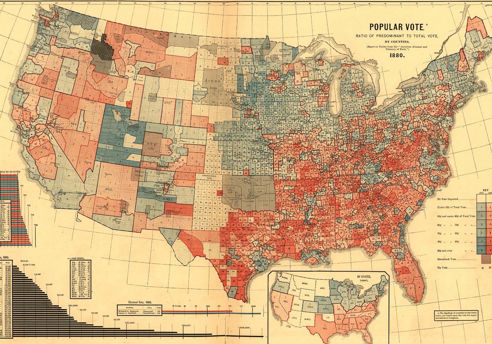
In 2012, Susan Schulten at the University of Denver was perusing her massive collection of atlases and found something she’d previously overlooked – an incredibly detailed map showing the county-by-county breakdown of the 1880 election that dates from 1883. As best as Schulten can tell (she’s one of the best at historical cartography, and has written a book on the subject, Mapping the Nation), this is the first map showing nationwide election returns and it’s actually quite modern with strength-of-voting by county painstakingly illustrated; no one click color intensity via Photoshop back then!
It chose red for Democrats, blue for Republicans, brown for Greenbacks (and apparently reservations) – and given the alignments of both the election and parties at the time, associating either red-left or blue-right wouldn’t have been accurate in any case. Unfortunately, the printer leaves no record of their logic, but a reasonable assumption is that given blue was the color worn by Union troops, they followed a general trend among many illustrators using that to indicate the North.
As the map indicates, the North indeed propelled former Union general and Republican dark horse candidate James A. Garfield to victory in 1880 (although as it also indicates, not quite as solidly as the overall electoral college totals would imply.) This association was still common even into the 20th century; after her grandson joined the National Guard around 1910, when he proudly went to visit her on leave, Harry Truman’s grandmother – whose house had been repeatedly pillaged by Union irregulars – berated him for being the first person wearing a blue uniform to step foot into her house for the better part of 50 years, and he never repeated that mistake.
Over the course of the next few decades, on the rare times that newspapers added (very expensive) colored inserts, they generally tended to pick whatever color they wanted – yellow was common – but more often for the main paper they used dots or dashed lines to fill a state box (or local district) in black, white, or other shades of grey.
In 1972, ABC used blue for Nixon and red for McGovern, but that was on a static map. In 1976, however, the all-color NBC kicked out Saturday Night Live from their studio and set up their war room with a full garish electronic map – this time intentionally giving red to Democrats and blue to Republicans. (Incidentally, NBC’s significant investment in color was a contributing factor in something else a few years earlier – the bright red, blue, and gold Star Trek uniforms!)
However, this was not consistent whatsoever between networks and different types of media. In fact, about the only thing that does seem to have taken place over the next 24 years – someone tracked it down – was that the deciding factor was the alternation of colors by incumbency rather than by party to avoid any permanent association.
Then came 2000 where the informal rotation by incumbency had swapped out Republicans to red and Democrats to blue. Tim Russert is generally given much of the credit for being the first to emphasize it by pointing out how Bush needed to win ‘these red states’, but so did Mike Barnicle and Paul Begala when they got into a tiff about cultural differences, and perhaps David Letterman cemented it by joking a week into the struggle that a compromise could be reached by Bush becoming President of the Red States and Gore of the Blue States.
All that stuck, and with the electoral map being on every TV screen all day every day, the colors became entrenched and do not appear likely to change any time soon.


